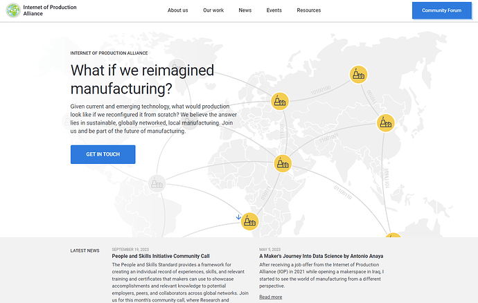
This is kind of embarrassing, but thought I’d share my user experience in the hope that it helps.
I’ve been to the Internet of Production Alliance website multiple times, going through each page in the menu (About us, Our work, News, Events, Resources) so I could get a better understanding of what it is all about.
https://www.internetofproduction.org/
Today I attended the Community Call and people linked to this community forum and I thought That’s weird, I didn’t see a link to the forum on the website. So I just looked at the website again and sure enough, there it was, in a big blue button on the top right corner. I was stunned that I had missed it. Reflecting a bit, I definitely was avoiding that user interface element subconsciously when I was browsing the site. I think I know why- a colored button at the top right corner of a website is almost always for logging in or signing up, and I wasn’t trying to log in to anything (which makes sense, because there is nothing to log in to), so I completely missed it.
Ironically, I think removing the emphasis of the colored background and just adding the link to this community forum as another item on the menu or submenu would make it easier to navigate to. That and/or adding it to a page in the website, possibly to the right of the blue “get in touch” button on the homepage.
It could be that I’m just blind, but if you see a trend of people unaware of this community forum, this might be why.
3 Likes
@jparadie - thank you… I LIVE for unsolicited user experience feedback (and I’m not being facetious here at all)!
I’ve actually had similar thoughts for a long time, and had been thinking about changing it for ages; we’ve been in a slight holding pattern for the last couple months on making any template/major updates to the site, as we’ve recently been through a rebranding process with Prophet.
I am flagging this for @AndrewLamb and @BarbaraSchack to ensure this feedback is integrated into our site redesign!
Thank you again. 
And, welcome to the forum @jparadie ! I encourage you to hop on over the the welcome and introductions thread to:
- Get an overview of our communications/content channels
- Introduce yourself and tell us a little bit about what you’re working on
Have fun, and let us know if you have any questions! 
Hello @jparadie, thanks for joining the December community call, it was lovely to meet you there.
I’ve shared your post with the web developer we work with. I would not expect any edits before the beginning of next year though  I second @schutton’s comment: it’s precious to have spontaneous feedback! Generous of you
  Especially as it was the first time I gave such a strong shout out to the forum during the community call, so that was very helpful follow-up.
Thanks for the warm responses! I’m glad you found the explanation of my experience helpful. I’d like to get more involved, so I’ll see you around. I’ll intoduce myself in the introductions thread next.
Edit: I did: My introduction post
